The Rise of Autonomous Agents in 2025 explores practical patterns, platforms, and governance conside...
Microinteractions That Boost Engagement in Interfaces
Microinteractions are the tiny, purposeful moments in an interface that guide users, convey state, and create a sense of delight. This practical guide covers the anatomy, design principles, six actionable microinteraction patterns, implementation steps, and metrics to measure impact.
Microinteractions are the small, purposeful moments that happen when a user interacts with an interface. They are the button that sinks slightly under a click, the field that lights up as you focus, or the subtle progress animation that reassures you something is happening. When designed well, microinteractions improve usability, reduce cognitive load, and create a sense of delight that keeps users engaged. At Multek, we see microinteractions not as decoration, but as a core part of a high-performing product design system — signals that guide users, communicate state, and reinforce trust.
Introduction
Why should you care about microinteractions? Because users don’t just read interfaces; they feel them. Tiny motions, haptic feedback (where supported), and well-timed cues help users understand cause and effect, anticipate outcomes, and stay oriented as they navigate complex tasks. The result is a smoother experience, fewer mistakes, and higher task completion rates. This post offers a practical framework you can apply across web and mobile apps to design microinteractions that genuinely boost engagement.
The anatomy of a microinteraction
Think of a microinteraction as a complete loop built around five core elements. Each microinteraction should have a clear purpose that ties to user goals and product outcomes.
- Trigger: What starts the microinteraction? It can be a user action (click, tap, swipe, type) or a system event (form submission, new message, data refresh).
- Rules: How the interaction unfolds — the path, timing, and easing that shape the motion.
- Feedback: What the user sees, hears, or feels to understand the result (color change, motion, sound, vibration).
- State: The beginning and end states (and any in-between states) that communicate progress or result.
- Loop (optional): Whether the interaction repeats or remains in a settled state until the next action.
When these elements are coherent and aligned with user intent, microinteractions become intuitive cues rather than random flourishes.
Design principles to maximize engagement
Use these principles as guardrails to ensure microinteractions add value without distracting or confusing users.
: Animate only when it conveys information (state change, progress, or feedback). Avoid gratuitous motion that adds cognitive load. - Speed and timing: Keep most microinteractions in the 150–300 ms range for quick feedback. For more complex state changes, 300–600 ms can work, but always test with real users.
- Consistency: Use a shared library of animation tokens (durations, easing curves, color changes) in your design system to create a cohesive experience.
- Accessibility: Respect users who prefer reduced motion. Provide non-animated equivalents or disable motion entirely when requested.
- Performance: Opt for CSS-based and hardware-accelerated animations when possible. Avoid layout thrashing and heavy repaint work.
- Brand voice: Let motion reinforce brand personality without compromising clarity. A playful brand can have a gentle bounce; a professional brand might favor smooth, restrained motion.
These principles help teams balance delight with clarity, delivering experiences that feel fast, reliable, and human.
Microinteraction catalog: practical types you can implement
Below are six practical microinteraction patterns you can adopt across interfaces. For each, we describe the user problem, the recommended approach, and a concrete implementation outline. Use them as a starting point and adapt to your product’s voice and technical stack.
1) Button press feedback and state acknowledgment
Problem: Users need to know a click/tap was registered and what happened next.
Approach: Provide immediate visual feedback on press and a subtle transition to the next state (e.g., disabled state, loading, or success).
Guidelines: Use a quick scale-down on press, a brief color/opacity change, and an indicator for the resulting state. Keep motion minimal and reversible.
/* CSS example: button press feedback */
button {
  background: #0b78e3;
  color: white;
  border: none;
  padding: 12px 20px;
  border-radius: 8px;
  cursor: pointer;
  transition: transform 0.15s ease, background 0.2s ease;
  will-change: transform;
}
button:active {
  transform: scale(0.95);
  background: #0a6bd3;
}
Tip: For toggles, reflect the state with aria-pressed and a distinct visual cue (e.g., color or checkmark) so the result is explicit for assistive tech users as well.
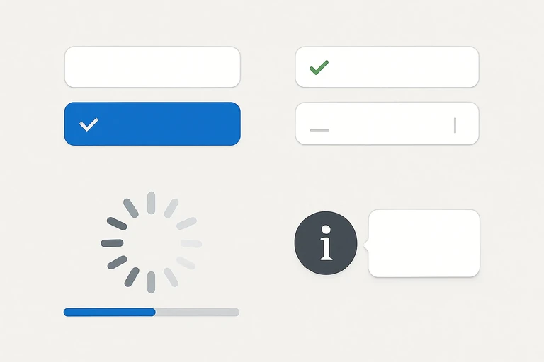
2) Focus and inline validation for forms
Problem: Users may lose track of focus or submit invalid data without clear guidance.
Approach: Highlight focused fields, provide real-time validation cues, and show non-intrusive success/error indicators near the field.
Guidelines: Use a clear focus ring, color-coded states, and a small animated check or exclamation icon when validation passes or fails.
/* CSS + HTML snippet (conceptual) */
<label>Email
  <input class="field" type="email" aria-invalid="false" aria-describedby="emailHelp"/>
</label>
<span id="emailHelp" class="hint">We’ll email a confirmation link.</span>
/* CSS */
.field { border: 0; border-bottom: 2px solid #ccc; padding: 6px 4px; transition: border-color 0.2s ease; }
.field:focus { outline: none; border-color: #4A90E2; }
.field[data-valid="true"] { border-color: #28a745; }
.field[data-valid="false"] { border-color: #dc3545; }
Tip: Use a small, accessible checkmark animation next to valid inputs to reinforce success without taking focus away from the primary task.
3) Loading states, skeletons, and progress feedback
Problem: Perceived wait times can frustrate users; without feedback they may assume the app is slow or broken.
Approach: Use skeleton screens during loading, animated progress indicators for ongoing tasks, and a final state that confirms completion.
Guidelines: Keep skeletons lightweight, animate progress bars with a smooth easing, and reveal content as soon as it’s ready.
/* Skeleton shimmer (illustrative) */
.skeleton { background: #e0e0e0; height: 1em; border-radius: 4px; overflow: hidden; position: relative; }
.skeleton::after { content: ''; position: absolute; top: 0; left: -100%; height: 100%; width: 40%; background: linear-gradient(90deg, transparent, rgba(255,255,255,.6), transparent); animation: shimmer 1.2s infinite; }
@keyframes shimmer { to { transform: translateX(200%); } }
Tip: Replace idle loading with skeletons for a more tangible sense of progress and to reduce perceived wait time.
4) Onboarding and guided tours
Problem: New users can feel overwhelmed by features and workflows.
Approach: Use guided cues, progressive disclosure, and contextual hints to teach critical actions at the moment they matter.
Guidelines: Start with a warm welcome, highlight only a few actions at a time, and offer a skip/turn-off option. Use motion to lead attention, not to distract.
/* Simple coach mark concept (pseudo) */
<div class="coachmark" role="dialog" aria-label="Tip: Add a new item by clicking Create">
  <span class="pulse">Create</span>
</div>
Tip: Keep the coaching content concise and actionable. Each tip should map to a user goal and a concrete next step.
5) Notifications, toasts, and in-context messages
Problem: Users miss important updates or feel overwhelmed by noisy chatter.
Approach: Deliver concise, actionable messages with a clear action path and a gentle, non-intrusive animation.
Guidelines: Use a short entrance animation, a visible close/undo option, and automatic dismissal after a reasonable period. Prefer subtle transitions over abrupt flashes.
/* Toast example (CSS-only) */
.toast { position: fixed; bottom: 20px; left: 50%; transform: translateX(-50%) translateY(20px); background: #323131; color: #fff; padding: 12px 16px; border-radius: 8px; opacity: 0; transition: transform 0.25s ease, opacity 0.25s ease; }
.toast.show { transform: translateX(-50%) translateY(0); opacity: 1; }
Tip: Include an optional action (e.g., Undo) when appropriate to support quick recovery from user errors.
6) Real-time data updates and micro-animations in dashboards
Problem: Data-rich interfaces can feel chaotic and hard to scan when numbers jump abruptly.
Approach: Animate transitions of numbers, bars, and charts to emphasize change while preserving readability.
Guidelines: Use smooth, non-jarring number tweening, and ensure color changes reflect magnitude (green for positive, red for negative). Avoid distracting motion that obscures data.
/* Simple number tween with requestAnimationFrame */
function animateValue(el, start, end, duration) {
  const startTime = performance.now();
  function tick(now) {
    const t = Math.min(1, (now - startTime) / duration);
    const value = Math.round(start + (end - start) * t);
    el.textContent = value;
    if (t < 1) requestAnimationFrame(tick);
  }
  requestAnimationFrame(tick);
}
Tip: When data changes are frequent, consider batching updates or using a small, non-intrusive easing that avoids distracting the user from content.
How to implement microinteractions: a practical workflow
Turning these patterns into reliable, scalable features requires a repeatable process. Here’s a pragmatic workflow you can adapt to your team and project scope.
- Discovery and audit: Review the product’s user journeys and identify moments where users could benefit from clearer feedback or guidance. List target microinteractions by user goal (e.g., “confirm action,” “enter data quickly”).
- Create a microinteraction kit: Define tokens for your design system — durations, easing curves, color states, and motion language. Create a lightweight library (CSS variables, small JS helpers) that engineers can reuse.
- Prototype and validate: Build quick prototypes (in code or tools like Figma/Framer) to test feel and timing. Gather feedback from teammates and a small user sample before production.
- Engineer with performance in mind: Implement with CSS transitions/animations or Web Animations API when needed. Cache animation tokens, minimize layout thrashing, and respect motion preferences.
- Test and iterate: Run usability tests and A/B tests to measure engagement, error rates, and task completion. Use findings to refine timing and state changes.
- Monitor and evolve: Track performance and user sentiment after release. Add or adjust microinteractions as the product evolves and new features appear.
Following this workflow helps teams ship microinteractions that are not only delightful but also aligned with business goals and accessibility standards.
Measuring impact: what to track
To prove that microinteractions are moving the needle, collect both qualitative and quantitative signals. Consider the following metrics and methods:
- Task success rate and time to complete: Do microinteractions reduce errors or speed up tasks?
- Perceived wait time and satisfaction scores: Do users feel the product is responsive and trustworthy?
- Error rate and friction moments: Are users pausing or flicking away during interactions?
- Engagement signals: Increased clicks on primary CTAs, higher completion of guided tours, or more frequent use of new features.
- Accessibility compliance: Are reduced motion preferences respected without sacrificing clarity?
When you couple these metrics with qualitative feedback (user interviews, usability tests), you’ll gain a richer picture of how microinteractions contribute to product success.
Common pitfalls to avoid
- Overusing motion: Too many microinteractions can overwhelm users and slow down tasks.
- Inconsistent timing or easing: A lack of design system tokens leads to a disjointed feel across screens.
- Animation headaches: Long, heavy animations or jank degrade performance and accessibility.
- Misaligned with content: Motion that doesn’t reflect state or intent can confuse users.
- Ignoring accessibility: Users with reduced motion preferences should have a clean, functional experience without surprise elements.
Conclusion
Microinteractions are more than eye candy; they are a practical toolkit for shaping perception, guiding behavior, and building trust in digital products. By anchoring microinteractions in clear triggers, responsive feedback, and a consistent design language, teams can elevate engagement without sacrificing clarity or performance. Start small with a prioritized microinteraction kit, test with real users, and iterate based on data. The result is a more delightful, efficient, and accessible interface — a win for users and a win for the product.
You may also like

DevOps is within reach for SMEs. This practical guide outlines a lean, value-driven approach to auto...

Deepfakes and AI-driven deception pose real risks to businesses, from executive impersonation to bra...